I'll be honest, the best person to photograph art is the artist themselves.
That may be surprising statement from a professional photographer that makes his living doing such things, but really the artist understands his or her work the most clearly. The subtleties of colour and tone, shade and light, shape and form are the keys to many successful reproductions. And no matter how accurate the calibrations of colour, exposure and output there is still room for an element of interpretation and understanding, that is why I prefer to work with the artist or curator to get the best results from the finished work, whether it is for a catalogue, reproduction print or for a website.
Having said the above, the artist themselves may not possess the knowledge, skills and equipment necessary to get the best out of their own work. Sure virtually all digital cameras (even some cheaper models) can capture a reasonable image, but if subtlety or impact is important to you then you should read on. But even with the best cameras, lenses and lighting available, the colour and tone of an artwork will be unique, and the film or digital sensor may not capture the work accurately as they all have an inbuilt response to these factors (known as tone curves and colour response). So even when everything has been done to render an accurate reproduction, the image will need the application of a skilled operator in Photoshop before the image is finalised for output.
Types of art photography.
There are broadly three types of art photography
1. Installation photography or gallery photography.
This is either a way of promoting the gallery or recording a particular event or exhibition in situ. Here lighting is likely to be reliant on ambient light, so try to avoid days of bright sunlight and be very careful about white balance (more on that later).
2. Reproduction for catalogue or web.
Really there isn't a great deal of difference between this and full scale reproductive work, accuracy and light are all important, only the size of the finished images will be smaller.
3. Reproduction for limited edition prints or posts.
Large size highly accurate reproductions of art works. The better the print the more the artist can charge - so there aren't any compromises you can safely take if you want a satisfied customer.
Which Camera?

If you are photographing art for reproduction prints then the quality of both your sensor and lenses are paramount. Consider the surface texture as important above all and ask yourself the question how much will my camera capture? If you want to produce high quality reproduction prints for limited release for sale to widen your potential market, then you wont want to compromise here, that's why many top end reproductive art photographers use a medium format camera with a digital back. With prices starting at around £30000 for top end gear, it is understandable why so many commission a photographer to do the work for them. Think about how large you want your prints to be. If it is for a catalogue only for example, lets say you'll want at least a front page at A4 then a modern DSLR should just about do the trick, if combined with professional quality lenses. If however, you are considering posters to sell in the gallery at A3 or above then the camera will need to be at least a full frame 35mm DSLR if you aren't to lose that all important surface texture. I use a Canon 5D Mark II which costs in the region of £2000 without lenses and combine that with the best lenses Canon make - the L Series which are in the region of £1000 each. Equally though aspiring photographers could use the Nikon D3 or Canon III series cameras. These cameras have in excess of 20 million pixels which in layman's terms means an A3 print is easily achieved without blowing up - i.e. without losing the detail those expensive optics and sensors can capture. I'm prepared to hire medium format gear as and when it is needed, as the costs are so extreme for ownership if these highly expensive cameras aren't being used daily.
Whilst we are discussing cameras then it would also be a good idea to look at
focal length. Wide angle lenses will for flat art (paintings etc) cause distortion in the frame, the square or rectangle will no longer be square or rectangular necessitating correction in Photoshop. In order to do this Photoshop will invent pixels to fill the spaces you're creating squaring up, I don't know about you but I don't like the idea of a computer program inventing pixels, no matter how clever. So ideally use a prime to medium telephoto - in 35mm terms 50 to 100mm.
Lighting.
As with all photography lighting is important, photography literally translates and "writing with light", but in art reproduction there are additional technical requirements to consider above what looks good the the eye. There are two vital factors here - evenness and colour or light temperature, both are important reasons for
not using daylight. Lighting should be even across the whole of the canvas or paper to within 1/10th of a stop, there should be no shadows from frames casting across the work. Colour temperature (measure on the Kelvin Scale) is also vitally important for accurate reproduction. That is why you should use a light source or sources of known known temperature like flash (strobes) or colour corrected halogen or fluorescent. Although it is possible to to colour correct fairly well (with limits) this is time consuming in Photoshop and means the photography has already lost one of their key touchstones for finishing the images. This is why daylight is unsuitable, even though daylight looks a standard colour to the eye, it varies widely according to time of day, whether it's cloudy or sunny blue skies, whether it's in shade or full light - any range between 5000k and 7500k which is a huge range in reproductive terms.
Lighting set up. 
To achieve even lighting with (as in the example above) two strobes you will need diffusers or softboxes to ensure the light source is diffuse. These should be positioned at 45 degrees and just forward of the camera.
You will also need a sturdy tripod, a cable release, a copy stand or easel, a measuring tape comes in very handy as does a camera mounted three way spirit level (the level on the tripod is not sufficient as I'll explain later) and a separate spirit level to ensure the art work is flat to the camera. If you take flat art at an angle from the camera then it will need to be straightened in Photoshop to correct distortions as in using a wide angle lens (above).
Exposure and Colour Balance.
Ensure you camera is set to RAW, RGB and noise control and sharpening are turned off.
Ideally in this situation a light meter should be used to calculate the correct exposure. Any experienced photographer will know that trying to take an in camera meter reading from different coloured surfaces can affect the meter reading dramatically. Short of this an 18% Grey Card would be a good starting point for a more accurate meter reading than in camera reading alone. In any case the photographer should exercise caution when deciding the exposure, detail can most easily be lost from the highlight areas even when the exposure is correctly calculated, so a third under is a good idea. More easy to correct is losing detail in darker areas from under exposure although equally it shouldn't be necessary to add the additional time.
So take a meter reading and bracket either side of it, checking both the camera's LCD screen and the histogram. Ideally for oils and watercolours especially a correct histogram will look something like this:
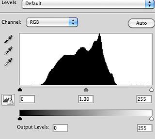
You will notice that neither the shadow end or the highlight end reach the edges of the frame, but there is plenty of exposure in the mid tones in the centre of the histogram This will ensure that there is no blowing out of highlight details or a lack of detail in the shadow ares. I realise that this is completely different to the textbook examples where the curve extends to both end of the histogram. However if you're dealing with painting then you will find in most cases the camera will not respond in the same way as in say a landscape or a well lit portrait. That is because even in a Neutral Raw mode the tone curve will be too strong and will need to be adjusted in post processing. In fact it is essential to set the camera to RAW and a Neutral preset. If you can connect your camera to a calibrated laptop at this stage for previewing images then all the better, but don't assume that the finished image will be finished when you press the shutter, there will always be more work in post processing.
Colour Balance.
As we should by now be working to a light source of known colour temperature then it should be relatively easy to choose the correct camera setting. Try to use the flash preset rather than setting it at Kelvin alone (daylight balanced flash is 5000k). This is because temperature is only part of the equation, those familiar with RAW processing will be well aware that in camera terms light is a mixture of both temperature (blue to yellow) and tint (magenta to green). The preset for flash on modern professional cameras will take into account both shifts. Of course both can be achieved manually in most cameras, but in all honesty it is easier to correct individual colours in Photoshop than it is to balance global colour shifts in camera, assuming that is that you are somewhere around the right region to start with.
Whatever even the best camera sensors have trouble recognising certain colours for example, magentas, acid greens, brownish yellows etc. We have to remember they are RGB sensors i.e. made up of Red, Green and Blue only. Those three colours do not always translate into more complex or unusual colours. How many times have you photographed bluebells only to find they appear a pale blue, when in fact they are a much richer purple tint in reality? Much better to correct in RAW processing later.
Post Processing.
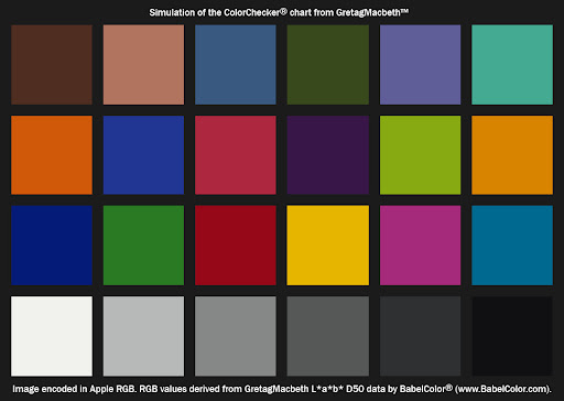
OK we should be ready to post process at this stage. Ideally you will be able to take flat art to a daylight lit room and in front of a high level calibrated monitor. That is by far the best and easiest way to finish the processing. Obviously this may not always be possible so there is a time saving short cut you can add to the capture stage by using a GretagMacbeth Colour Checker included in one of your photographs.
This is a carefully printed card containing many colours that camera find difficult to replicate as well as a grey scale. It is then easy enough to match those colours in RAW processing and save that process as a RAW Preset to apply to the image that doesn't contain the colour chart.
Anyway, I'm getting ahead of myself here! Before colour there are a few things to consider. Firstly, you will need to attune your eye to the subtleties of the work you are photographing, whilst there isn't room here to give a course in art appreciation, you should make time to talk to the artist or curator about what is important about the work. Not only will this make the experience far more enjoyable, but you will start to get an idea of what to look for in the finishing of your image for reproduction. I prefer to sit down with the artist or curator during at least the first few images I process (hopefully with the artwork in front of us at the time) in order to gain both trust and confidence in the processing.
Raw Processing.
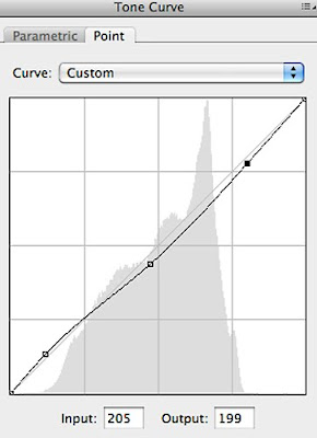
The first stage is to set the White Point, named Exposure in Raw processing. Carefully move the slider to the right whilst keeping a close eye on the highlight areas, move it only as far as the image is lightened, but stop before detail is lost. Next set the Black Point named Blacks, again increasing it only so far as detail is retained. The finished result may not look like the painting in front of you, so the next stage is to adjust the tone curve. In most cases this will mean lightening shadows and diminishing highlights, plus and increase or decrease in mid tones depending on the image. Great care should be taken here as small movements can result in big changes to the image.
Only at this stage (and once you happy with the tonal response) do you start to work on the colours. Tonal changes will affect colour in RAW processing so it is best to complete that first. Start by moving the sliders on the first tab to achieve any global changes that might be deemed necessary. Then proceed to the HSL tab for control of individual colours. You have a choice of three movements in colour processing - Hue, Saturation and Luminance and Lightness. Look carefully for any colours that haven't registered correctly, look for any that appear to bright or "pop" on the screen or any that are too dull, that require additional saturation. Once you are happy with hugh and saturation, check the lightness against the image or colour chart and adjust accordingly, you may find you will need to move back to saturation after this is complete to re-ajust for any changes made by luminance. RAW processing for the image is now complete, but sadly don't assume you can save these changes as a preset and apply them to every picture captured as it just wont work, each painting is unique and if you can't see that then you really shouldn't be doing this! Before moving out of RAW, ensure sharpening and luminance noise control are set to zero and only as much colour noise reduction as is necessary is used - I usually find 4 is sufficient. This is because sharpening should be applied later according to the reproduction image size.
Further Processing.
Ensure your output from Raw is set to 16 Bit, RGB and 300DPI.
There are a few finishing touches that are either easier to apply in the full Photoshop or are only possible there. First up is spotting, an important step is to thoroughly check the image at 100% magnification for any dust spots that maybe showing. These should be carefully removed using the clone stamp tool.
Secondly this is the opportunity to ready your image(s) for output, i.e whether it is web use, large scale print reproduction or a smaller size catalogue print. You will notice that until this stage the process is exactly the same for every output.
Web output.
Firstly you will need to resize the image according to the size it will be used. Only after that should sharpening be applied do this carefully as most paintings and drawings don't exhibit a great deal of sharpness anyway. It is better to use a low level sweep that concentrates on the surface texture only. After this it MUST be converted from RGB to sRGB or it will look muddy on screen.
Print Output.
Again as with web the image will need to be resized according to it's proposed use, obviously vastly different between an A5 catalogue shot and a 30X60 reproductive print. Then sharpened according to that size only. Print sharpening differs from web sharpening in that we are no longer reliant on what we can see o the screen. As a rough guide for A3 prints you should apply something like 150 with a far larger radius of perhaps 2.5 or more and a threshold of between 0-4. The best way to check is to do a test print and repeat until you're happy. As all printers and images vary it's just not possible to be more specific than this.
If printing you own images, it is best to use an 8 colour printer or better 12 (as there is more control) that has been correctly calibrated. For reproduction work there is a large selection of art inks and papers that not only will be able to replicate the look of the original and last up to 100 years if properly protected and kept out of sunlight and damp conditions. This doesn't mean the artist will need to print a whole batch of limited edition prints in one go as modern printers are remarkably accurate at reproducing colour and tone over considerable periods of time.
I hope that has been a help as a how to guide to art reproduction, If you've got this far and still don't want to try and do it yourself, then by all means get in touch with me either via
email at
open aspect photography
or my website at
open-aspect.co.uk .